Monday, 16 March 2015

Andy Worhol Remake


I  made my own version if Andy Worhol's work.

I think my work is similar in that I have used different and bright colours for different parts of the image. Also I have different versions of my image that uses different colours.

To improve my image and make it more like Andy Worhol I could try and get rid of all of the white areas on my image and I think it looks a little bit to realistic. Also Andy Worhol has changed the colour of people hair in many of his images so I could so this as well.

Sunday, 15 March 2015

Photography Trip

Pinhole Photography
On this trip we used a quality street box with a small hole in the top as a camera. The tin have photographic paper inside of it so when it was exposed to light it took an image. Depending on how bright it is outside depends on how long to expose it to light. You then have to remove the photographic paper out on the tin when your in a dark room so the paper is not exposed to any more light. You then have to put in the different chemicals to make the picture appear on the photo and keep the image on the paper.


These are the photos that I took on this trip.

Tuesday, 10 March 2015

Andy Worhol

Andy Worhol was a successful magazine and ad illustrator who became a leading artist in the pop art movement. He did many different art forms including performance art, filmmaking and videos installations. 

He had a degree in fine art and became one of the most successful commercial artists when he got a job with Glamour magazine. He spent more time focusing on his art work, which is when he start pop art. 


I think that his work is really creative and stands out compared to a lot of other different pieces of art. His work is really bright and he uses contrasting colours which i really like. I also like the way that he many did his art bases around people. He always uses a really bright background which makes his art work stand out even more. 

Hannah Hoch Work

Friday, 27 February 2015

Cause for Concern Wall


 This is our final Wall for out Cause for Concerns stencils. I have three pieces of work on this wall and helped to make the 'Cause for Concern' title.
On this wall there are different stencils for different campaigns.


Sunday, 15 February 2015

Hannah Hoch

Hannah Hoch

Hannah Hoch was born in November 1889 and died in May 1978, aged 88. She studied in Berlin and worked as a pattern designers and writers on woman's handicrafts. Her artist partnership with Raoul Hausmann cause her to become part of the Berlin Clue Dada. However she expressed herself less politically than others in the group.

Hannah Hoch was a german pioneer of art known as photomontage. Many pieces of her were mocking the up and coming beauty industry of her time gaining greater importance in mass media through fashion and advertising photography. Women were a main theme in much of her work from 1963 to 1973. Also she used racial discrimination to make a statement. Some of her political work from the dada period shows the liberation of women all side the social and political changes of that time. Hannah Hoch was the only women who was part of the art movement known as dada.

In her work she use photos, other paper objects, pieces of machines and other objects to produce a final image, this were usually quite large. She intentionally continued to produce her photomontages, after the war, to be exhibited until he death.

Her most famous piece is Schnitt mit dem Küchenmesser DADA durch die letzte weimarer Bierbauchkulturepoche Deutschlands, this is a critique of the Weimar in Germany in 1919. To make this piece she combined images from newspapers of the time mixed and re-created them to make a new statement about life and art in the Dada movement. 


This is one example of Hoch's work, I think this photomontage is really clever because of the way different faces are used to make one face. I like the contrasts of the faces together. I also like the fact that even though all of the faces are different the bodies are all the same.


I also like this picture because of the way the face doesn't look like it fits right on the body and also I like that the face is mainly all the same apart from one of the eyes.


This is my favourite photomontage of Hannah Hoch's I really like how all of the eyes are different, I think this could show that no two people are the same and I think this is a really clever way to show this. I also like how this eyes put together look like a case of flowers.


This is my recreation of one of Hannah Hoch's photomontages.

Tuesday, 3 February 2015

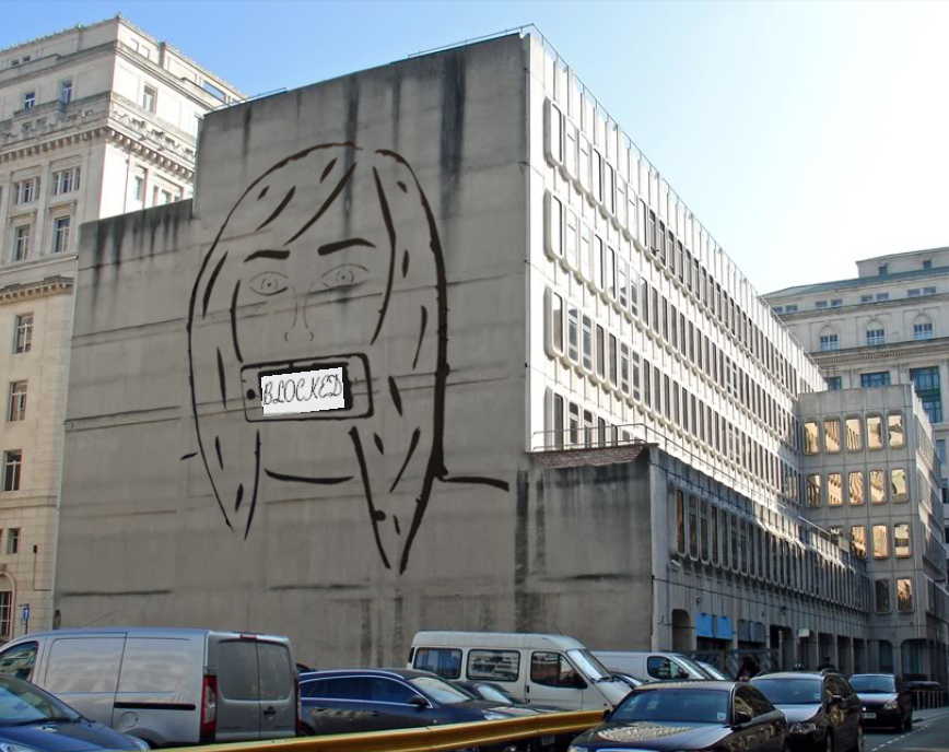
Stencil


This was my finished stencil cut out.
First I had to draw put my design again onto A3 paper because A4 was to small for my design to be easy to cut out. Then I had to use a scalpel to cute out the shape I had drawn. For the smaller detail like the eyes and nose I had to use a double balked scalpel, this meant I could cut two lines at  time also these lines were very thin so easier to add in detail with.
When cutting out my stencil I chose not to cut out the eye lashes because, i took to much detail and time to do this. I also didn't cut out the writing and edited the writing in when I edited my photo in photoshop.


This was the final black and white stencil I made. To do this I got my stencil on a white piece of paper and use back paint and a sponge to go over the stencil.

Also I made different back ground to put my stencil onto, I used power paint make some of my backgrounds. This meant I had different colour backgrounds to make the picture more interesting. I also had a plain black piece of paper as background, so I used with paint to print the stencil out on it. However the stencil went more of a grey colour because the white paint mixed with the black paint because I couldn't wash my stencil. I made five different prints altogether.


 Once I had finished all of my stencils, I used the back and white image and put that into photo shop so I could edit it. First I had to find a good image of a real life wall that I could put my stencil onto. I used the magic wand tool to select the parts of my stencil and then dragged it onto the image of the wall. I then had to change the size and perspective of the stencil image so it looked more life like. Once the perspective had been changed I had to add the writing into my image. I added the text in white but I had to change the colour to more of a grey colour. I also had to change the font of the writing and the angle of the of text so it looked a little more like a real image.