Tuesday 16 December 2014

Evaluation

Evaluation

1. Ideas Generation
For the ideas process we has to make different designs for a certain thing, we did this when design logos and posters. I think it was important to do this because then we would have different designs to choose from and decide which was the best idea for the final design. Doing this made us pick the best design for what we wanted, we had different designs which were maybe better than our first idea.

Sketching out design layouts
We did this when designing many different things like a webpage or poster, this was so we knew exactly what we were doing and how we were going to make it. I think this really helped when we came to photoshop to actually make the design. Also if when designing something it didn't look right then we could change the layout of it.

Mock Ups
To make all of our mock ups we got photos of the internet that were close to the images we wanted and using photoshop we created the image that we had designed. This helped us to decided weather we liked the design and weather the design is how we imagined it.

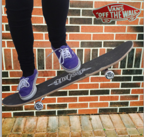
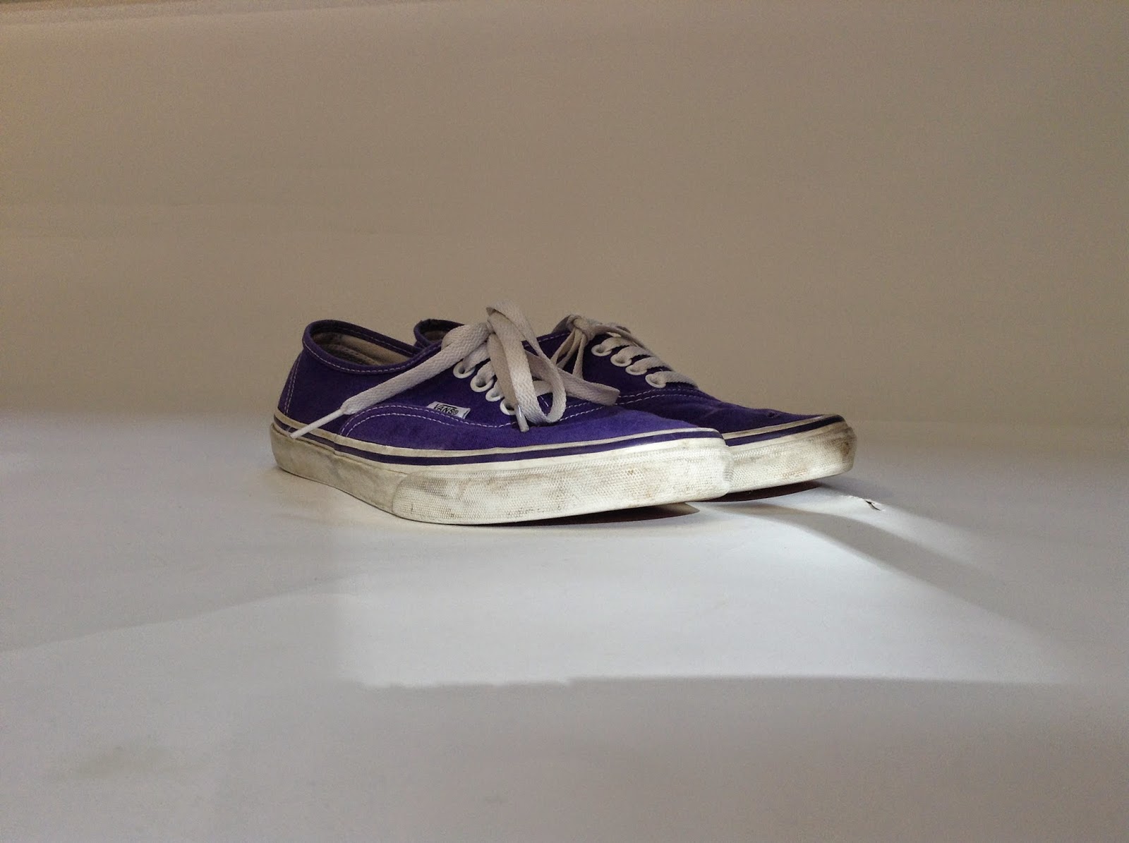
Studio and Location Photography
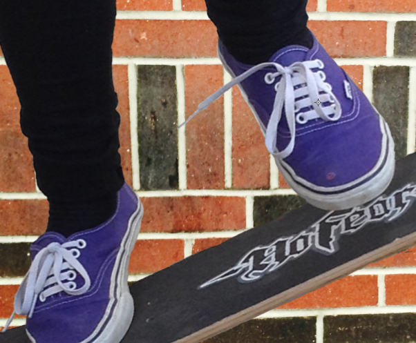
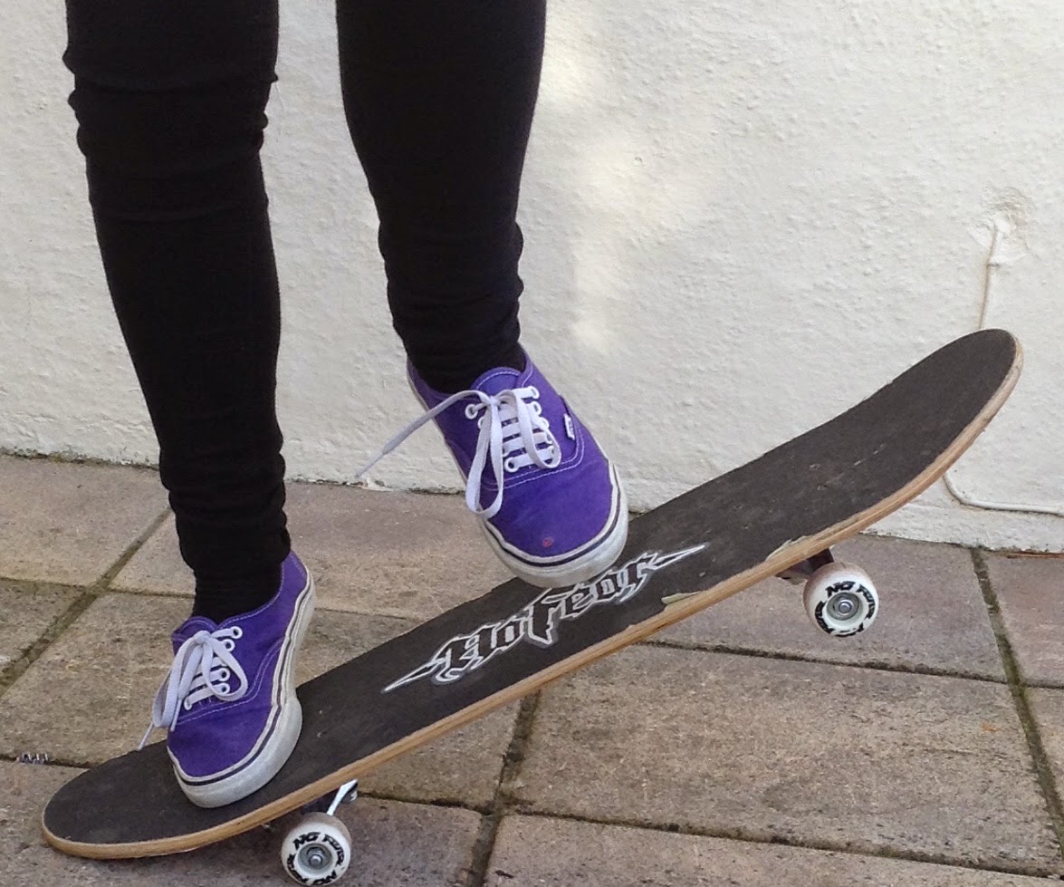
We used a pair of shoes and took photos of them using different lighting and different positions. We used a reflector outside to use natural sunlight to change how bright the photo was or the way the shadow was. We also used a spotlight inside and changed where that was positioned, this shows us how different lighting can effect the quality of an image.


Edit
The photos that worked the best were the ones that we used with the spotlight pointing straight at the shoes, because this made the shoes stand out and look brighter than the background. The inside spotlight photos worked better than the outside photos using just sunlight.

Photoshop process of making final poster
For my final poster I made a poster for vans using photoshop. I did this by taking the photos that I needed and putting them into photoshop. I used the mask layer tool to remove the background of the photos that I didn't need. Taking my own photos helped me to make sure that photos weren't blurry, also this made sure that I had exactly the photos that I needed.

Putting it into a real life setting
To put my poster into a real life setting I got a photo of a billboard and used photoshop to change the perspective of the photo. I also had to use the mask layer tool to remove small parts of the photo.


2. Idea Generation and creativity 
Some strenghs of having to design different ideas for things is that you may have a better design than the first one. Also if you have different designs to can take bits of each that you like and come up with a really good design. However some weaknesses are that sometime you can tell weather the design is going to look right when you actually come to make the design. Another thing is that design take time to come up with and sometime you end up not having enough time to make the final piece.

Target Audience and Company
Having a certain target audience and company is an advantage because you then know what type of thing you need to design and you know what type of people the idea is being aimed at. This can really help when design because you can get a clear image of what type of design you need to please the target audience. Although sometimes it can be hard to make a design that fits with the audience you have, if you have a target audience of people you don't know much about or what type of thing they like then it can be difficult to create a good design.

Mock Up
Making a mock up is a massive strength when designing something because it shows you what the design is going to look like for the final piece and you can decide weather the design is good. Also you can change the design of something if it doesn't look right. However a weakness of a mock up is that a lot of the time the final design looks very different from the mock up.

Photographs of trainers, props and location
Taking the photos for our final design was a strength because it made sure that we had the photos that we wanted and also when putting the photos into photoshop the photos weren't blurry like the photos when they are from the internet. A weakness of this was that sometimes it was hard to take the right photo that you needed for the design.

Editing the best images for the final design
Editing the photos was a good thing because we got to make the photos the way that we wanted them, if they were wrong when we took them. However it was a weakness because it took time to make the photos they way we wanted them.

Photoshop process of making final poster
Using photoshop was a strength because it helped to remove the parts of the photos that weren't needed and it meant that I could layer photos on top of each other. Although it took quite a long time to remove the background of the photos in the right place.


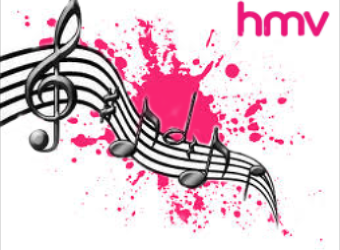
3. I think that my final design were suitable for my target audience, I had a target audience of teens and I think my design met that. Also I think that it was meeting the brief properly because I did all of the stages that we had to and I did different ideas for each. I think that my design were bright and colourful so I think they would hook the buy and attract them to the shop. Also I think that my design for the 2D poster was the most interesting and the way I could edit it made it more interesting. I don't think that the quality of my animation wasn't very good because I don't think it look at all like my logo and the animation itself was to fast. Also when animating I move parts to far so when it all went together it was was very short. I didn't really have any technical issues when re branding my company the only thing that was difficult was making the 2D poster when editing the music staff. I also had to find the way to change the colour of an image which I did in the end so it wasn't an issue. I think that my re branding links to the audience because of the colours and the picture used in my designs, it was also clear. Also I think it showed quite a clear message to the target audience and in how the designs were played out.


Tuesday 9 December 2014

HMV Poster Designs

 This was my main 2D poster design for HMV.

 Both of the black and white Designs would be more appropriate for people who like more edgy music. I think this because both of the design are dark and more mysterious.


 This design is brighter than the rest of them, I think the target would be people who like pop music or mainly teens.

This logo is for anyone I think because its quite bright but not quite as bright as the pink but yet not are dark as the others.
 I think that this design would have a target audience of people who like rave music or rock.

Monday 1 December 2014

HMV Logo

 HMV Logo
First I had to design different logos for HMV, once i'd chosen which logo I had to find the images I needed to make the logo. I put these photos into photoshop. I started with a black pair of headphones, to change the colour I had to duplicate the background layer, use the magic wand tool and select the parts I wanted. I then used the bucket tool to fill in the headphones pink. Next I had to drag the CD into the background and remove some of the corners of the main photo. Once the CD was in the right place I dragged the HMV logo onto the photo and positioned it in the right place.


This is my final logo for HMV.

Tuesday 25 November 2014

Unsuccessful Company - HMV

HMV

I have selected this company as a failing and unsuccessful company because its sales has decreased over the past few years and now not many people buy from stores like HMV. I always think that the brand identity of HMV isn't very good, their logo is quite plain and they don't have anything to really make people want to go into the store.

HVM sells things like DVDs, CDs, Accessories for phones and things like posters or t-shirts. Most of these things can now be bought online on iTunes. DVDs can be rented, you can watch them on different sites like Netflix and they can be bought in more local shops like Asda or Tesco. More people tend to buy music online so they don't need to go out and buy a DVD. Also most of these products could be ordered online for a cheaper price.

I think that HVM mainly has a target market of teens or young adults, I think this because these are the sort of people who would go out and buy new CDs or DVDs. However this shops is also for everyone because of the range in things they sell.

I think that the platform they will use to advertise would be on things like TV, social media sites like Facebook and Twitter. Also they could make an app for music subscription so that would bring them more money and a more well known company.

Friday 21 November 2014

Marketing and Advertising Agencies

Fire Dog
Fire Dog is a branding and advertising company that has helped to re-brand a lot of companies that have been failing. It has done a lot of work that have helped companies to get noticed and improve there company.
 This is an example of the work that firedog have done, this is for the charity Barnardos. There is a massive difference in the old design and the new design. The design that firedog has made was a lot brighter and attracted more people. However the old design used quite violent picture to advert, this advert uses picture that are calmer and more attracting to the eye. The firedog design is a lot better than the first one, this is how the charity has rebranded.


Don't Panic

Don't Panic is another company that redesigns companies to help them to rebrand.

This is the design that Don't Panic have made, I think by using something like lego to rebrand will have made the brand more popular. This is also a more interesting design and it has made the company more appealing.


Thinking Juice


 Thinking Juice have rebranded tango, they have made the design a lot more interesting to look at and it had attracted more people to Tango. This design has added more detail. Also the old design was quite boring with a black background and the logo was a lot more discrete. The new design had the logo bold so it stands out and a bright colourful background to also make it stand out.


Tuesday 18 November 2014

Failing Companies


 Although blackberry use to be a very popular company they are now failing as other companies like apple have better products than them. Also people now see blackberry as a bad and tacky company, I think that part of the reason people see blackberry like this is because of the uncreative logo and name. Blackberry is a name that is to similar apple and orange. Another thing that is making this company fail is there logo they have, I don't think it was very creative or  good logo to attract people to the brand.
I think that there poor branding has definitely effected the lack of customers they get because there logo doesn't stand out or make people want to buy from that brand. However I think that the main reason they are failing is because other brand have made better products so they have taken way blackberry customers. Although blackberry did try to create a product that was equally as good however they still didn't get the customers back.


HMV also use to be a very popular brand but now most people buy albums and songs online through iTunes. They also don't have a very creative logo, because its mainly just there name in bold letters. Although they have good products to buy the only thing people would buy now is films because they may be cheaper in store than online. Also you can buy CDs and films in shops like Asda or Tesco so people would more likely buy them there than going to HMV.


Sony is also another failing company, because there are better companies like panasonic. Also with the products they make most people will already have and they will last a long time so they won't need to buy them very often. Also the logo is quite simple and it doesn't stand out very much. I think if they had a better logo then they could attract more people to buy from them, they could have a brighter colour or they could add something to there logo.


Sports Direct is failing because of the type of products they sell. There products are said to be quite cheap and tacky so people don't want to buy them, therefore they don't get many customers. There are also many other places that people could go for all of the things that sports direct sell. Also you don't know weather you will find what you are looking for there because they have a mixture of al lot of different things. As well as that Sports Directs logo haven't got a very good logo, it could be more creative.


Monday 17 November 2014

Real Life Poster

This is my poster in a real life situation, this is how I imagine my posters being used to advertise vans on billboards.

Vans Advertising Poster


 I first dragged all of the photos I needed into photoshop, then I moved the photo of the vans logo onto to the wall. Once the logo was in the right place I had to use the mask layer tool to remove the the background of the logo.  I used the brush tool to do this, then when I had demoed the parts  didn't need of the photo, I used the skateboard photo and dragged this photo onto the wall as well.


 This was what the Vans logo looked like once I had deleted the background.


I added the Skateboard photo to the wall but I had to then crop the photo of the wall to make the Skateboard fit better. Once I'd make the background photo small I again used the mask layer tool to remove the parts I didn't want.

This is what the shoes and skateboard looked liked after I had edited the background.


This was the first photo I took to use as, this was the only photo that had worked once id put it in photoshop. I had to other photos that were actually in the air, however they were fuzzy when I put them into photoshop.


This was the final photo.


Friday 7 November 2014

Still Life Images Homework


Still Life Photography Trainers

This was using lighting from only one side, i like the way this makes the shoes look. I also like how you can slightly see the shadow of the shoe in the background. I would use this type of lighting again to take photos.
 I really like this photo this was using really bright light on the centre of the shoe. This is my favourite photo because of the way the background is so bright and the shoes are bright and stand out in the centre.


This photo was using all natural lighting, I like how the light from the window is on only part of the shoes. However I don't like this photo, next time I don't think i'll use the natural lighting.
This was only with  the light on part of the shoes which I like because it makes the front part of the shoe stand out.


This photo was using lighting going straight to the front of the shoes, i like this because it makes the front stand out and also I like how different areas of the white background are brighter than others.


This is my favourite photo, I like the way that the shoes look they are brighter in this photo compared to the others.


This photo makes the purple really strong, which is what I like about it.

The other photos that I took outside didn't change the lighting and all looked very similar.