Tuesday 20 January 2015

Banksy

Banksy
This graffiti image could be showing how much the little thing on social networks effect people in the way that they do. It could be trying to make people think about whether it really matter what other people think. This also could be showing how lonely people can feel if they don't get noticed on social websites. This shows that even the small things can effect people in a big way. He has used a really simple way of showings that no one has noticed him and you know he's upset because of his facial expression. Also being in such a public place can show that it effects a lot of people.

This image could be showing hope for people and saying that they shouldn't fight certain things. Also the heart ballon being the only thing in colour, he could maybe want people to mainly focus on that. I think it could symbolise that you should love everyone no matter who they are. I think they main point of this picture is to give hope to people and to really think about whether something is worth fighting for. Another meaning for this graffiti could be to let other people help you but don't get involved in something you don't need to.


I think that this graffiti could be showing that simple things can change what you really want to do. But also this could show that to make your dreams come true you need to make them realistic, you need to give yourself something to really work towards. But if something gets in your way it doesn't mean you have to 'cancel' your dream you just have to work harder to get to where you want to. I think the point of this being in a public place if to make people think about whether what they are wanting to do will not work.

Friday 16 January 2015

My Chosen Campaign - Smoking

My chosen campaign - Smoking


Propaganda

Propaganda 

 All of these propaganda images all use red as the main colour of their designs. They all have small parts of other colours to add detail. Red can be a very powerful colour, its bright but sometimes sets an angry mood. It can get someones attention because its so bright and it stands out a lot but it can hook a person because of how the colour is used to create an image. It could also hook a person to the poster because of the type of mood the colour red sets or because of what red can make people think of. I think red is a very good colour to uses especially when design a war poster because of the way red can symbolise blood in a war, because of what it can symbolise it can deliver a message to people. I think all of these have been made by printing.


All of these images use the colour yellow as their main colour in their designs. Yellow is also a very bright colour as well which can be used to attracted peoples attention. Also yellow can be used as a kind of happy colour, so the designers could be using this colour to create a happier mood. I think that this colour if powerful because of what yellow is meant to symbolise and I think this is used to create the mood for the campaign. I think this campaign is enhanced by using yellow as their main colour because its a bright and cheerful colour.


All of these poster use blue as the main colour, its mainly used as a background colour in these posters. Blue comes across as a calm colour, it can also symbolise confidence and stability. They made use blue so the point of the posters come across as a confident message to the public. This can be a powerful and hooking colour because it can mean so many different things and different shades of blue can make to feel different ways. If it was a dull blue like the picture in the middle it can create a dull mood for the poster, but because the colour doesn't stand out to much it can make you focus on the main part of the image. 


 All of these colours can be used in a design to make someone feel a certain way depending on the message you want to get across.

Flash Mob


Tuesday 13 January 2015

Smoking Design Evaluation

Evaluation

When making my design I focused on smoking.
The top where it says 'think' was a possible slogan that I could have, it would have been telling someone to think before they do. They also need to think about what they are doing when they know its bad for them.

There is also a gun tats made of cigarettes, this could symbolise that smoking kills even though some people don't realise whats its doing to them inside.

I also have a clock with cigarette hands, this suggest that if you smoke then your running out of time. Then having the writing saying 'your running out of time' could make them think about what they are doing and the consequences. Also it is meant to make them think about if they are actually running out of time.

Two of my design say 'trapped?' on them, the first was meant to be a cigarette in the shape of a person and the second was meant to be a person stuck inside a cigarette where you can only see their head. Both of these were to make the people think about whether they really are trapped by cigarettes and whether they are hooked by them.

The design at the very bottom of the page is a cigarette with different people standing on top of it, it also says 'it doesn't just effect you.' Having the different people shows who else it could effect, it could effect someone if you are smoking while being around them but it could also effect other people if the person smoking became ill or died from it. I quite like the idea of the design.

My final design is my favourite design out of them all, its an eye with the reflection of a cigarette saying 'we can see it in your eyes.' This could show that it really does effect you on the inside and the outside. This shows just how much it effects you and how much people can see it. This is definitely my favourite design because I like the idea of having the reflection in the eye.

Monday 12 January 2015

Video Awareness Campaigns

Video Awareness Campaigns

This campaign is an anti smoking campaign to make people think about stopping smoking. The music they use in this video is quite slow and its not that noticeable. However I think this music is used to make the person watching the video sad in a way. This will then make them question what they are doing and why they are feeling the way they do because of the music.


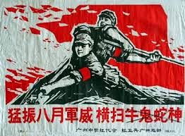
This campaign is about fragile children and how they see their parents when their parents are drunk or under the influence of alcohol. This music is very unnoticeable at the start but it become you become aware of it when you see the first horrible thing turn around to the screen. The sudden jump in the music makes you think that the child was scared as well. The music makes you feel a certain way.

This campaign is another video for smoking again using children to make parents who smoke feel guilty. This music is more noticeable at the start than the others, this type of music is also slow and makes you feel sad which is the way the people in the video look like they feel. I think the music making you sad will help to make people think about it more if they are suddenly saddened by an advert.

I think that using music is such a powerful hooking technique because it makes you feel a certain way when you watch the video which is the way the people making it wanted you to feel. Also because you feel this certain way I think it makes you pay more attention to the video than you would if the music wasn't their. The music makes you engage with the video more and it makes you question why you feel that way.

Peer Assessment

Peer Assessment
You have chosen effective imagines that reflect on what message is being put across. You have analysed them well picking out the right target audience. You have explained what the message in each imagine is accurately. I think you are working at a grade A/B

Smoking Campaigns

 I think that the target audience for this campaign is for people that don't realise how much they are effecting their life by smoking. I think that this campaign is trying to make them think about what they are doing. They have used all dark colours for this campaign. Having the dark background helps to make the writing stand out although it isn't very big its still noticeable.
This campaign isn't as dark as the other but it makes the man look like he is struggling. They also use a rhetorical question to make the person question if they are hooked or not. I think this is aimed at older people than before because of the way the man is lying on the floor.


I think that this campaign is the best out of all of them, because they use children to make the adults think about what they are doing. The children ask the adults if they can get a light but the adults say how bad smoking is what they are doing it themselves. It makes you think the that adults have forgotten what they are doing to themselves when they know other people especially children shouldn't be doing it. I think this would be a really good advert to target at parents with children.                                              The Best Anti-Smoking Campaign Ever - Youtube                


All of these smoking campaign are aimed at people who smoke and they all try to make the person think about what they are doing to themselves without even realising sometimes. The video campaign is different in that it mainly focusing on children which are making the adults question them and what they are doing. The second poster image I think its making them question if they really are hooking unlike the other which are trying to make you think about weather what your doing is right or not. All these campaign are doing one thing which is making the person think in different ways about what they are doing.


Public Information

Public Information Unit 2 Information Campaign - NHS
This campaign is an NHS campaign to stops smoking. This is good because it uses guilt to get noticed, the parents might feel guilty about how the child feels. This also uses a real life situation of how child feels about a parent.  The only thing I think is bad about this is the the pictures don't stand out they are all quite dark, which is a sad effect which is good in a away because then it could make the person really think about what the poster is saying. This is a poster campaign that the NHS have used.

 http://resources.smokefree.nhs.uk/campaign/

 Awareness Campaign - Charity
 I think this campaign makes the writing really stand out. I think this would catch peoples attention because of the abstract image in the centre and how the image is Surreal. Although this image is black and White it still stands out because it's different from most others. I think this poster campaign would have been made using an editing program for example photoshop.

http://cached.imagescaler.hbpl.co.uk/resize/scaleToFit/460/460/?sURL=http://offlinehbpl.hbpl.co.uk/galleries/OMC/35946_125554_image005.jpg

Conscious Messaging - Propaganda The words in this campaign really makes you think about what would happen. Also the image of the man and the facial expressions of him catchy your attention. I think it could be improved by making one part of the image really stand out. Although I think the image is mean to be dark and sad in a way I think it would be good to make a part of the image stand out, this way it would catch people's eyes more. I think the words really make this poster because they make you think.

http://upload.wikimedia.org/wikipedia/commons/d/d2/AntiJapanesePropagandaTakeDayOff.gif

Mind Map

Mind Map - Public Information
 They use guilt o get to you
 They use things to advertising on such as
 -radio
 -tv
-social media
 -email
 -bus stops
 -posters
 -billboards
 -magazines or newspapers
 They persuade you
 Public information is a way to give information to people