Public Information Unit 2
Information Campaign - NHS
This campaign is an NHS campaign to stops smoking. This is good because it uses guilt to get noticed, the parents might feel guilty about how the child feels. This also uses a real life situation of how child feels about a parent. The only thing I think is bad about this is the the pictures don't stand out they are all quite dark, which is a sad effect which is good in a away because then it could make the person really think about what the poster is saying. This is a poster campaign that the NHS have used.
http://resources.smokefree.nhs.uk/campaign/
Awareness Campaign - Charity
I think this campaign makes the writing really stand out. I think this would catch peoples attention because of the abstract image in the centre and how the image is Surreal. Although this image is black and White it still stands out because it's different from most others. I think this poster campaign would have been made using an editing program for example photoshop.
http://cached.imagescaler.hbpl.co.uk/resize/scaleToFit/460/460/?sURL=http://offlinehbpl.hbpl.co.uk/galleries/OMC/35946_125554_image005.jpg
Conscious Messaging - Propaganda
The words in this campaign really makes you think about what would happen. Also the image of the man and the facial expressions of him catchy your attention. I think it could be improved by making one part of the image really stand out. Although I think the image is mean to be dark and sad in a way I think it would be good to make a part of the image stand out, this way it would catch people's eyes more. I think the words really make this poster because they make you think.
http://upload.wikimedia.org/wikipedia/commons/d/d2/AntiJapanesePropagandaTakeDayOff.gif
Monday, 12 January 2015
Mind Map
Mind Map - Public Information
They use guilt o get to you
 They use things to advertising on such as
-radio
-tv
-social media
-email
-bus stops
-posters
-billboards
-magazines or newspapers
They persuade you
Public information is a way to give information to people
They use guilt o get to you
They use things to advertising on such as-radio
-tv
-social media
-bus stops
-posters
-billboards
-magazines or newspapers
They persuade you
Public information is a way to give information to people
Tuesday, 16 December 2014
Evaluation
 Evaluation
1. Ideas Generation
For the ideas process we has to make different designs for a certain thing, we did this when design logos and posters. I think it was important to do this because then we would have different designs to choose from and decide which was the best idea for the final design. Doing this made us pick the best design for what we wanted, we had different designs which were maybe better than our first idea.
Sketching out design layouts
We did this when designing many different things like a webpage or poster, this was so we knew exactly what we were doing and how we were going to make it. I think this really helped when we came to photoshop to actually make the design. Also if when designing something it didn't look right then we could change the layout of it.
 Mock Ups
To make all of our mock ups we got photos of the internet that were close to the images we wanted and using photoshop we created the image that we had designed. This helped us to decided weather we liked the design and weather the design is how we imagined it.
Studio and Location Photography
 We used a pair of shoes and took photos of them using different lighting and different positions. We used a reflector outside to use natural sunlight to change how bright the photo was or the way the shadow was. We also used a spotlight inside and changed where that was positioned, this shows us how different lighting can effect the quality of an image.
Edit
The photos that worked the best were the ones that we used with the spotlight pointing straight at the shoes, because this made the shoes stand out and look brighter than the background. The inside spotlight photos worked better than the outside photos using just sunlight.
Photoshop process of making final poster
 For my final poster I made a poster for vans using photoshop. I did this by taking the photos that I needed and putting them into photoshop. I used the mask layer tool to remove the background of the photos that I didn't need. Taking my own photos helped me to make sure that photos weren't blurry, also this made sure that I had exactly the photos that I needed.
Putting it into a real life setting
To put my poster into a real life setting I got a photo of a billboard and used photoshop to change the perspective of the photo. I also had to use the mask layer tool to remove small parts of the photo.
2. Idea Generation and creativity
Some strenghs of having to design different ideas for things is that you may have a better design than the first one. Also if you have different designs to can take bits of each that you like and come up with a really good design. However some weaknesses are that sometime you can tell weather the design is going to look right when you actually come to make the design. Another thing is that design take time to come up with and sometime you end up not having enough time to make the final piece.
Target Audience and Company
Having a certain target audience and company is an advantage because you then know what type of thing you need to design and you know what type of people the idea is being aimed at. This can really help when design because you can get a clear image of what type of design you need to please the target audience. Although sometimes it can be hard to make a design that fits with the audience you have, if you have a target audience of people you don't know much about or what type of thing they like then it can be difficult to create a good design.
Mock Up
Making a mock up is a massive strength when designing something because it shows you what the design is going to look like for the final piece and you can decide weather the design is good. Also you can change the design of something if it doesn't look right. However a weakness of a mock up is that a lot of the time the final design looks very different from the mock up.
Photographs of trainers, props and location
Taking the photos for our final design was a strength because it made sure that we had the photos that we wanted and also when putting the photos into photoshop the photos weren't blurry like the photos when they are from the internet. A weakness of this was that sometimes it was hard to take the right photo that you needed for the design.
Editing the best images for the final design
Editing the photos was a good thing because we got to make the photos the way that we wanted them, if they were wrong when we took them. However it was a weakness because it took time to make the photos they way we wanted them.
Photoshop process of making final poster
Using photoshop was a strength because it helped to remove the parts of the photos that weren't needed and it meant that I could layer photos on top of each other. Although it took quite a long time to remove the background of the photos in the right place.
3. I think that my final design were suitable for my target audience, I had a target audience of teens and I think my design met that. Also I think that it was meeting the brief properly because I did all of the stages that we had to and I did different ideas for each. I think that my design were bright and colourful so I think they would hook the buy and attract them to the shop. Also I think that my design for the 2D poster was the most interesting and the way I could edit it made it more interesting. I don't think that the quality of my animation wasn't very good because I don't think it look at all like my logo and the animation itself was to fast. Also when animating I move parts to far so when it all went together it was was very short. I didn't really have any technical issues when re branding my company the only thing that was difficult was making the 2D poster when editing the music staff. I also had to find the way to change the colour of an image which I did in the end so it wasn't an issue. I think that my re branding links to the audience because of the colours and the picture used in my designs, it was also clear. Also I think it showed quite a clear message to the target audience and in how the designs were played out.


Tuesday, 9 December 2014
HMV Poster Designs


Monday, 1 December 2014
HMV Logo
 HMV Logo
First I had to design different logos for HMV, once i'd chosen which logo I had to find the images I needed to make the logo. I put these photos into photoshop. I started with a black pair of headphones, to change the colour I had to duplicate the background layer, use the magic wand tool and select the parts I wanted. I then used the bucket tool to fill in the headphones pink. Next I had to drag the CD into the background and remove some of the corners of the main photo. Once the CD was in the right place I dragged the HMV logo onto the photo and positioned it in the right place.

Tuesday, 25 November 2014
Unsuccessful Company - HMV
HMV
I have selected this company as a failing and unsuccessful company because its sales has decreased over the past few years and now not many people buy from stores like HMV. I always think that the brand identity of HMV isn't very good, their logo is quite plain and they don't have anything to really make people want to go into the store.
HVM sells things like DVDs, CDs, Accessories for phones and things like posters or t-shirts. Most of these things can now be bought online on iTunes. DVDs can be rented, you can watch them on different sites like Netflix and they can be bought in more local shops like Asda or Tesco. More people tend to buy music online so they don't need to go out and buy a DVD. Also most of these products could be ordered online for a cheaper price.
I think that HVM mainly has a target market of teens or young adults, I think this because these are the sort of people who would go out and buy new CDs or DVDs. However this shops is also for everyone because of the range in things they sell.
I think that the platform they will use to advertise would be on things like TV, social media sites like Facebook and Twitter. Also they could make an app for music subscription so that would bring them more money and a more well known company.
Friday, 21 November 2014
Marketing and Advertising Agencies
Fire Dog
Fire Dog is a branding and advertising company that has helped to re-brand a lot of companies that have been failing. It has done a lot of work that have helped companies to get noticed and improve there company.
 This is an example of the work that firedog have done, this is for the charity Barnardos. There is a massive difference in the old design and the new design. The design that firedog has made was a lot brighter and attracted more people. However the old design used quite violent picture to advert, this advert uses picture that are calmer and more attracting to the eye. The firedog design is a lot better than the first one, this is how the charity has rebranded.

Don't Panic
Don't Panic is another company that redesigns companies to help them to rebrand.

This is the design that Don't Panic have made, I think by using something like lego to rebrand will have made the brand more popular. This is also a more interesting design and it has made the company more appealing.

Thinking Juice
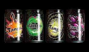
 Thinking Juice have rebranded tango, they have made the design a lot more interesting to look at and it had attracted more people to Tango. This design has added more detail. Also the old design was quite boring with a black background and the logo was a lot more discrete. The new design had the logo bold so it stands out and a bright colourful background to also make it stand out.
Fire Dog is a branding and advertising company that has helped to re-brand a lot of companies that have been failing. It has done a lot of work that have helped companies to get noticed and improve there company.
Don't Panic
Don't Panic is another company that redesigns companies to help them to rebrand.
This is the design that Don't Panic have made, I think by using something like lego to rebrand will have made the brand more popular. This is also a more interesting design and it has made the company more appealing.
Thinking Juice
Subscribe to:
Posts (Atom)