
 All of these propaganda images all use red as the main colour of their designs. They all have small parts of other colours to add detail. Red can be a very powerful colour, its bright but sometimes sets an angry mood. It can get someones attention because its so bright and it stands out a lot but it can hook a person because of how the colour is used to create an image. It could also hook a person to the poster because of the type of mood the colour red sets or because of what red can make people think of. I think red is a very good colour to uses especially when design a war poster because of the way red can symbolise blood in a war, because of what it can symbolise it can deliver a message to people. I think all of these have been made by printing.
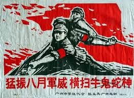
All of these images use the colour yellow as their main colour in their designs. Yellow is also a very bright colour as well which can be used to attracted peoples attention. Also yellow can be used as a kind of happy colour, so the designers could be using this colour to create a happier mood. I think that this colour if powerful because of what yellow is meant to symbolise and I think this is used to create the mood for the campaign. I think this campaign is enhanced by using yellow as their main colour because its a bright and cheerful colour.


All of these poster use blue as the main colour, its mainly used as a background colour in these posters. Blue comes across as a calm colour, it can also symbolise confidence and stability. They made use blue so the point of the posters come across as a confident message to the public. This can be a powerful and hooking colour because it can mean so many different things and different shades of blue can make to feel different ways. If it was a dull blue like the picture in the middle it can create a dull mood for the poster, but because the colour doesn't stand out to much it can make you focus on the main part of the image.


All of these colours can be used in a design to make someone feel a certain way depending on the message you want to get across.
No comments:
Post a Comment